

POSKOTA

SUMMARY
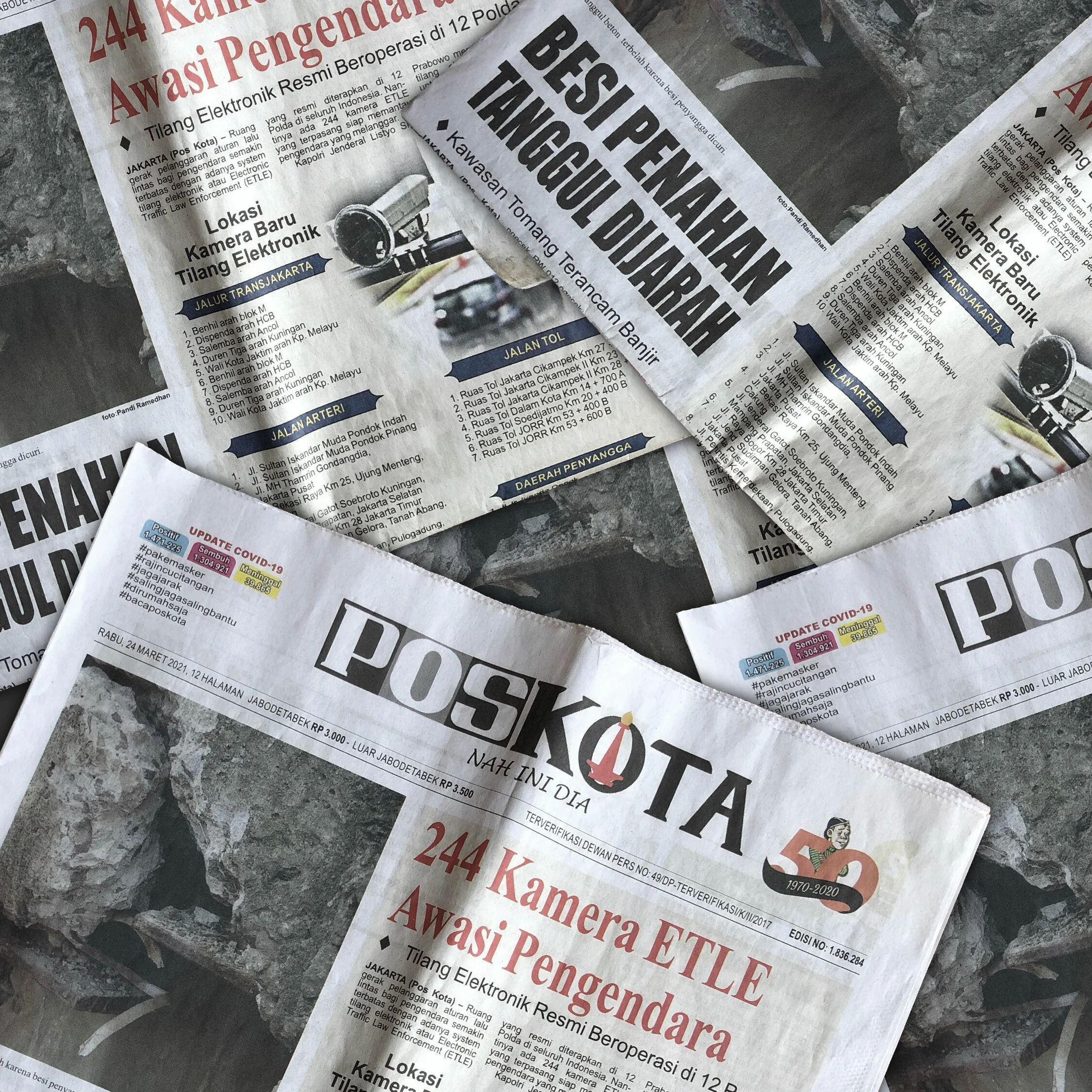
Being one of Jakarta’s biggest news agencies, Poskota has been serving relevant news to the public for the past fifty years. However, in this digital age, Poskota sees the need to revamp itself into something more.
Poskota has expanded its network to other cities in recent years, and entered the digital news portal, and a rebranding is carried out to communicate the transformation of Poskota

Solution
Rebranding a well-known, fifty-year old company takes a number of careful considerations. The brand has to be familiar enough with the existing users, but it must look different enough to signify the changes. We have decided to keep the iconic national monument graphic in the logo, as a homage to the city where Poskota was born, but certain modifications to the typography were carried out to make the brand appear modern, relevant, and trusted to the target audience.


Countless iterations have been made to find the perfect balance between familiarity and freshness, and the final logo also incorporates “70” as the year when Poskota was first published by having the national monument silhouette superimposed on top of the letter “O”.
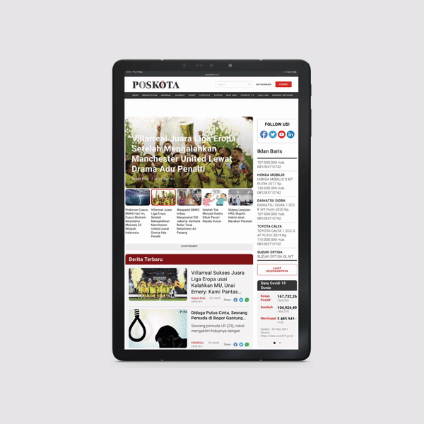
As a part of the rebranding process, we have also redesigned the look and feel of the digital newschannel to appear uncluttered, easy to read and navigate.