a (FRND) of mine

Summary
Started off in 2016 as comfortable lounge wear with super nice fabric that you want to live in, A Friend of Mine has evolved over the year into something edgy and outspoken. The brand journey sees the personality shifting into something that is more honest, with a tone of voice resembling a blunt friend that you’d love to hate, but still love them to bits anyway because they’re your friend.
The evolution also sees a change in their collection, which will focus more on the basic wear. T-shirts, hoodies, sweatpants, and everything in between, it’s something that you’d want to wear to any occasion, save your best friend’s wedding.
With a change this significant in 2020, a rebrand is in order, and we’re in it for the wild ride. It was an exciting journey for us, as the brand owner kept pushing us saying “Not crazy enough!”, until we finally hit “YES, this is the one!”


Solution
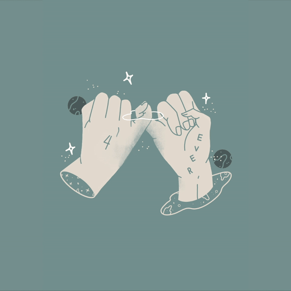
The brand identity is kept basic, and we decided on the shorthand writing of the brand into (FRND), the idea is to keep the flexibility of changing “friend” into whatever else your heart tells you to. We also had fun in creating the rest of the graphic identity, starting from the hand gestures to represent the most basic communications, to some secret handshakes that only a close friend would know.
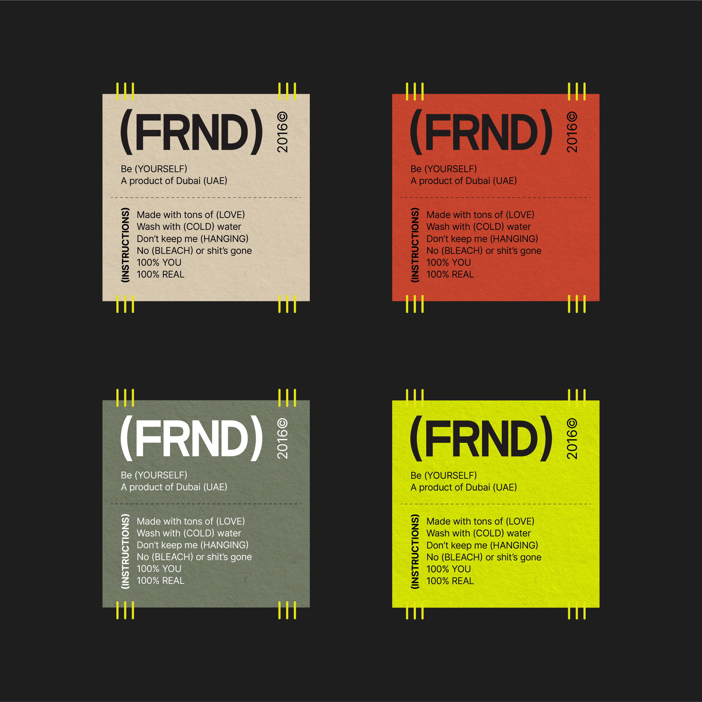
The idea is to keep the brand edgy and being really loud at the same time, which inspired us to explore some unusual color combinations and finally settled on the color palette you see here.
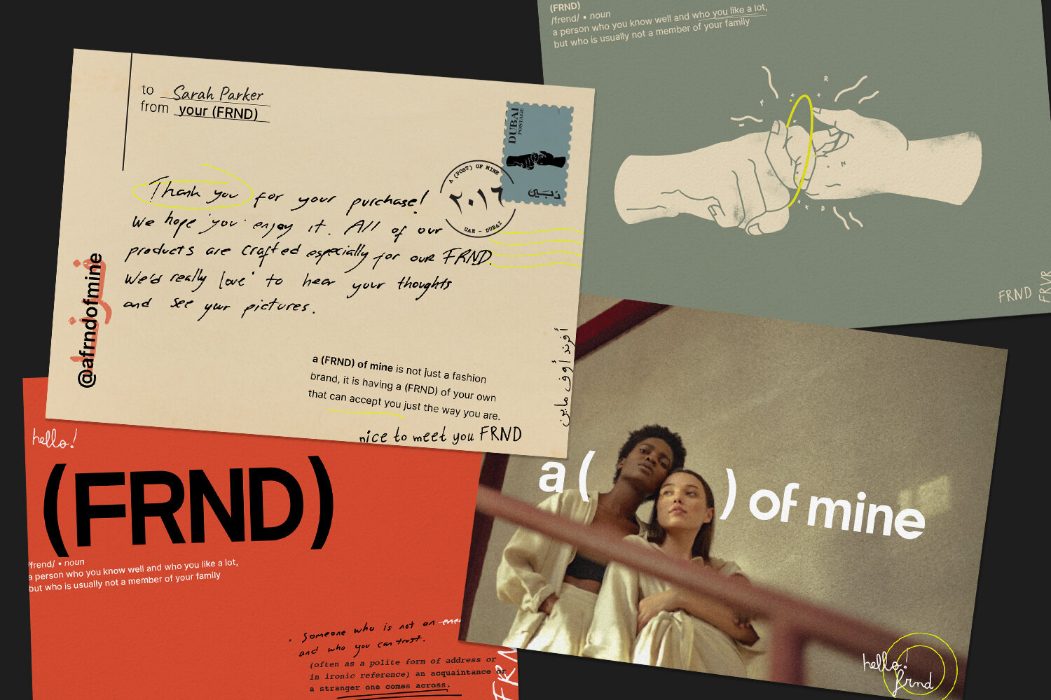
To keep the brand experience intact through the consumer journey, postcards, tags, bags and giveaway stickers complete the whole ecosystem of the brand.